Oats Overnight / Cross-sell + Upsell
Making room for discovery.
Turning a subscription-management homepage into a place to discover relevant products, evaluate add-ons, and move into a larger box.
Product strategy · End-to-end product designThe shipped experience
A new reason
to open the app.
Discovery gets a place on the homepage, before the familiar subscription tasks.
Live customer portal · Mobile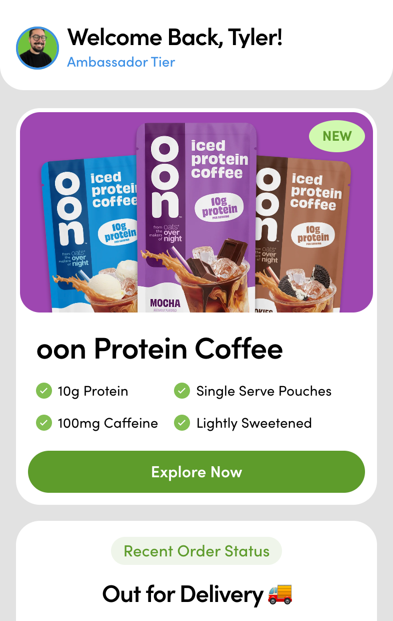
01 / Make discovery visible
Interrupt the routine.
Earn the attention.
Customers landed here to check an order or manage a subscription. I wanted that familiar visit to also introduce something worth trying, without requiring a separate trip to the shop.
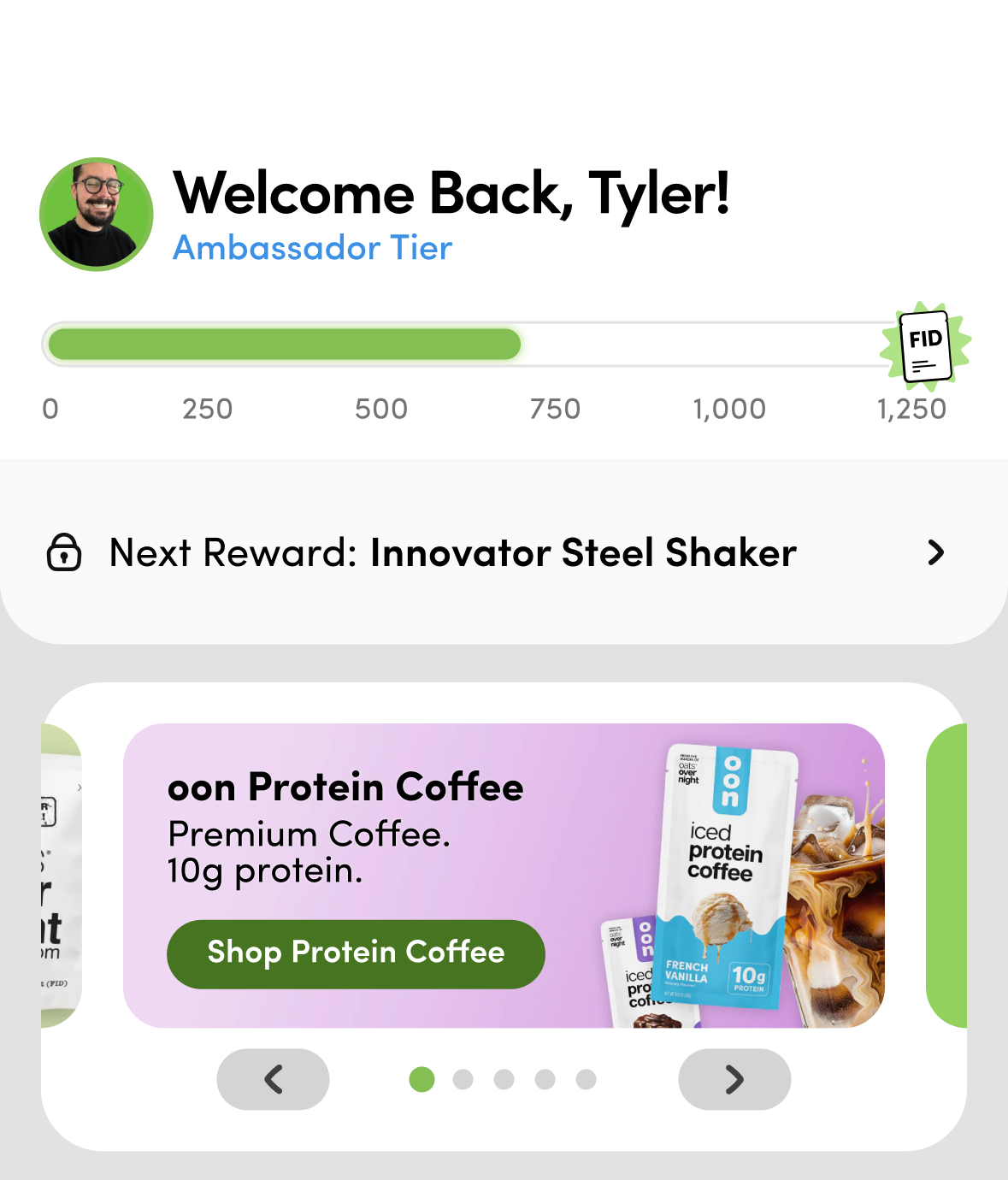
I reduced the loyalty header and gave one offer the prominent placement previously occupied by a carousel. Product imagery and concise benefits explain the value before “Explore Now” invites the next step.
From discovery to choosing
The next step is the product.
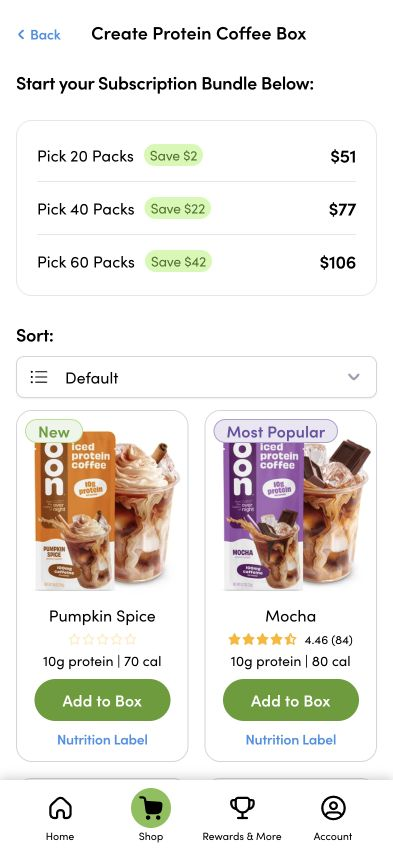
In the shipped experience, Explore Now opens the Protein Coffee box builder directly. Customers can compare pack sizes and choose flavors. The earlier education flow in Figma is a design reference; this screen shows the actual destination.
02 / Make the add-on understandable
Right beside the box
they already know.
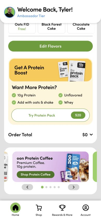
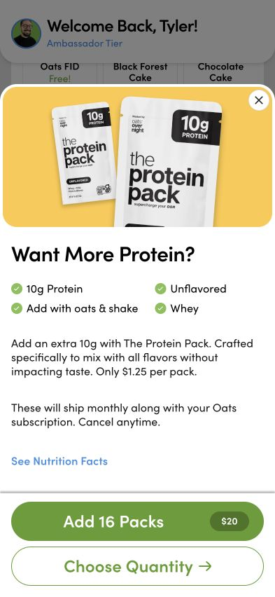
Quick Add sits beneath Edit Flavors, where customers are already considering their next delivery. Protein Pack explains what it adds, how to use it, and the price before opening the details.
The next screen makes the commitment explicit: 16 packs for $20, shipping monthly with the Oats subscription, with cancellation available anytime. Customers can also choose a different quantity.
Quick Add / Documented progression
- 01Protein Pack
Oats subscription
- 02Extra FIDs
Already has Protein Pack
- 03Pack upgrade
Already has both
I reused existing eligibility rules. The design notes prioritize this sequence for Oats subscribers; coffee-only subscriptions skip Oats add-ons, and the upgrade hides at the maximum pack size. FIDs are Flavors in Development.
03 / Prepare the next step
A bigger box.
Still their flavors.
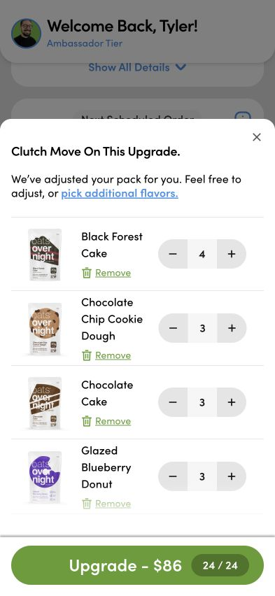
Manage → Upgrade to 24 Pack opens a prepared box. The system adjusts quantities to 24/24, so customers can evaluate the upgrade without rebuilding their selection.
They keep control: remove a flavor, adjust quantities, or pick additional flavors. The persistent action shows the total alongside the pack count. Less setup, with the final choice still in their hands.
Shipped outcome
Discovery joins the everyday journey.
The live portal brings homepage discovery, contextual add-ons, and prepared upgrades into subscription management. These shipped interactions are the outcome shown here; revenue and conversion impact remain unverified.
My contribution
I owned the work end-to-end: product strategy, experience design, offer placement, interaction details, and delivery.