Teladoc Health / A more connected care experience
One brand. A clearer path to care.
Turning a complex healthcare ecosystem into a more consistent experience, from choosing care to understanding the details.
Brand experience · Product design · Design systems- shared product language
- 1
- of focused product work
- 9 months
- contrast on the icon system
- AA / AAA
Connected care cards, icons, and interaction patterns.
Project OneApp: brand expression, components, icons, and motion.
Line weight and color tested for healthcare accessibility.
Project OneApp · Brand expression, product details, and reusable visual systems. Illustration exploration and sketches by Tyler; an independent illustrator produced the final artwork.
One language across care.
Project OneApp screens flowing through a shared brand and interaction system.
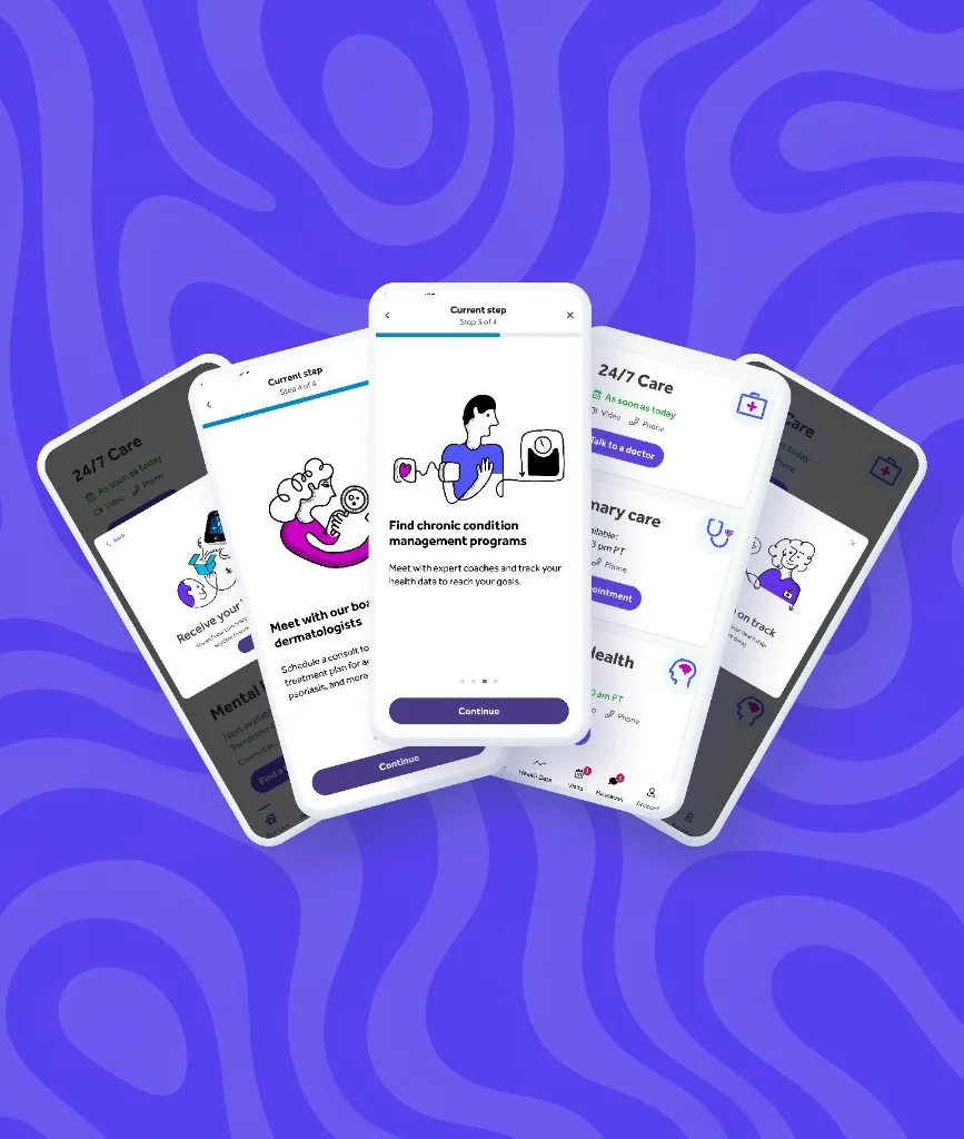
A shared identity across care.
Project OneApp brought fragmented experiences into one product language.
01 / A more human illustration system
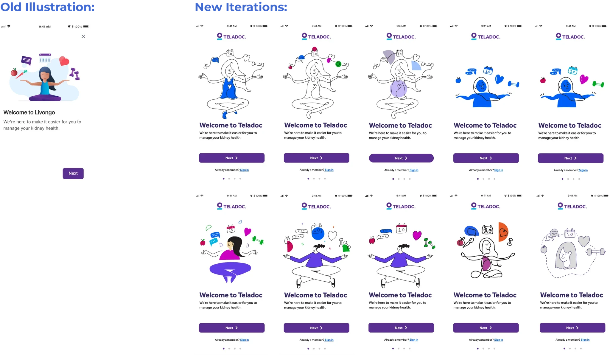
Find the right expression.
One concept, explored across styles to compare warmth, tone, and clarity.
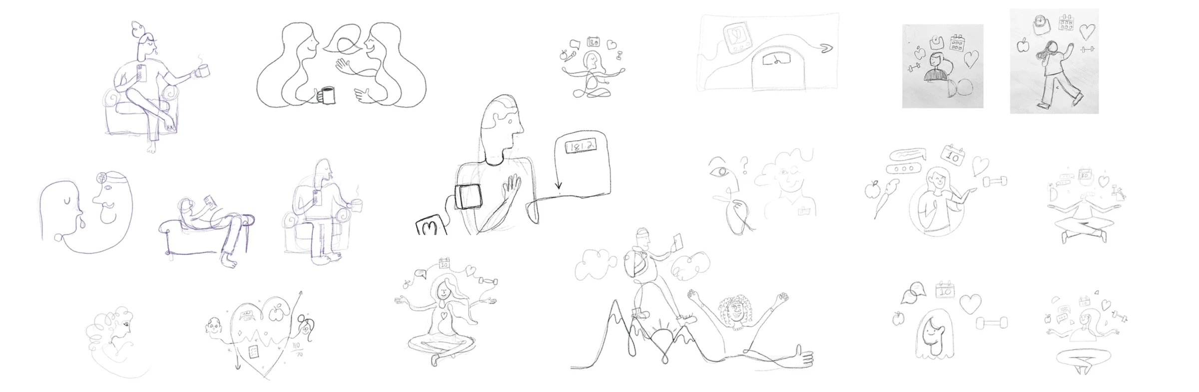
Connection, drawn into the system.
Tyler’s exploratory sketches. An independent illustrator produced the final artwork.
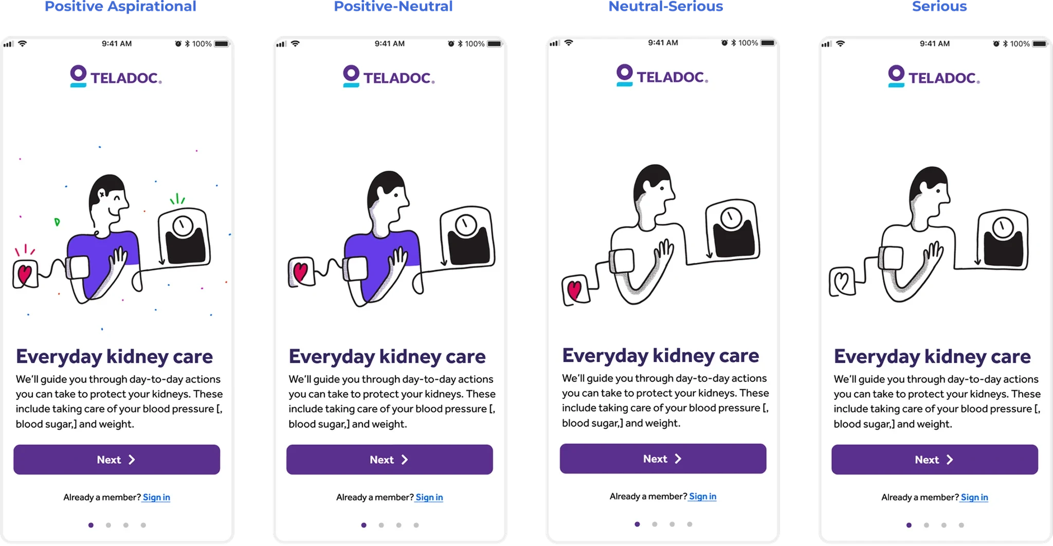
A consistent style. A sensitive tone.
The visual language had to work for both everyday wellness and serious health concerns.
02 / Clearer details, better interactions
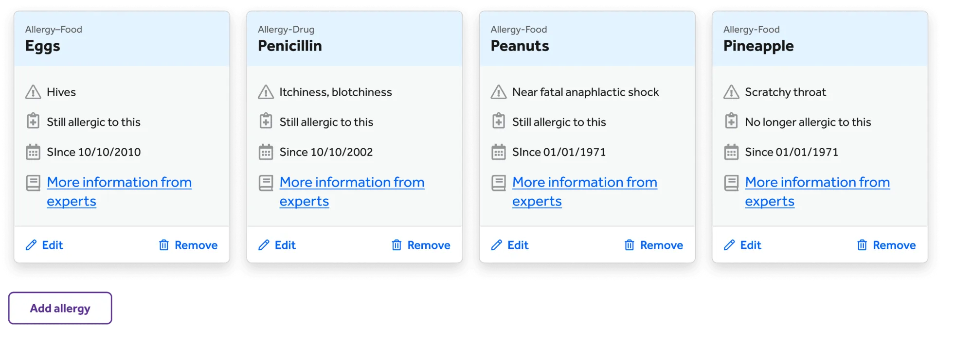
Before.
Severity reads the same.
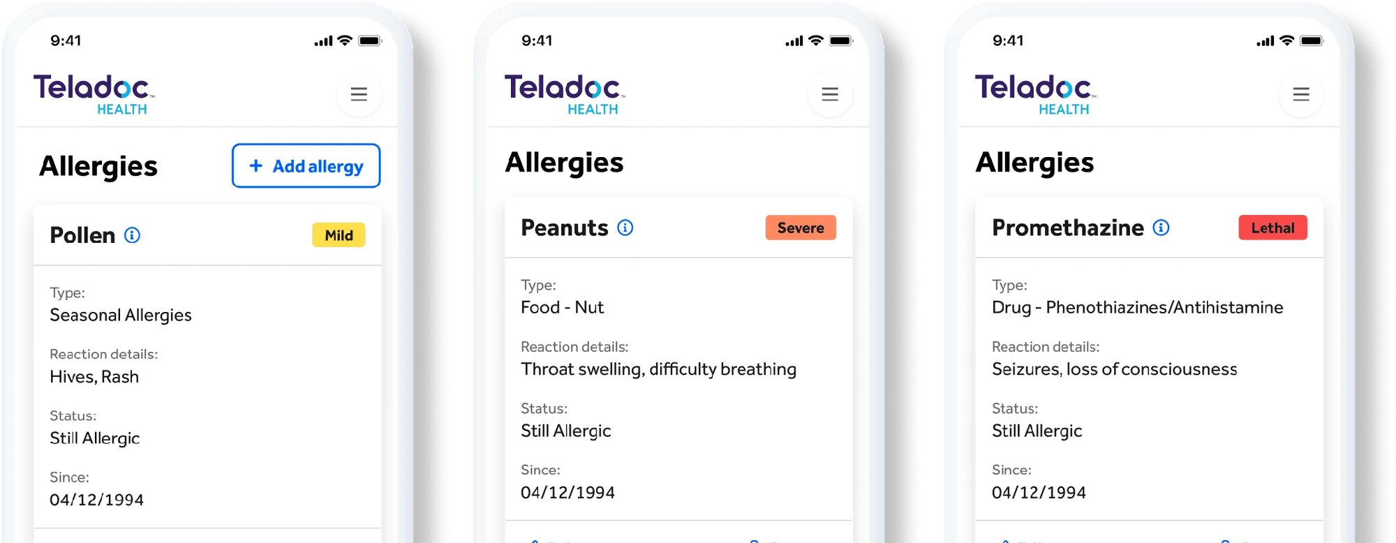
After.
Labels and hierarchy you can act on.

Waiting, with a pulse.
Loader studies for every data fetch.
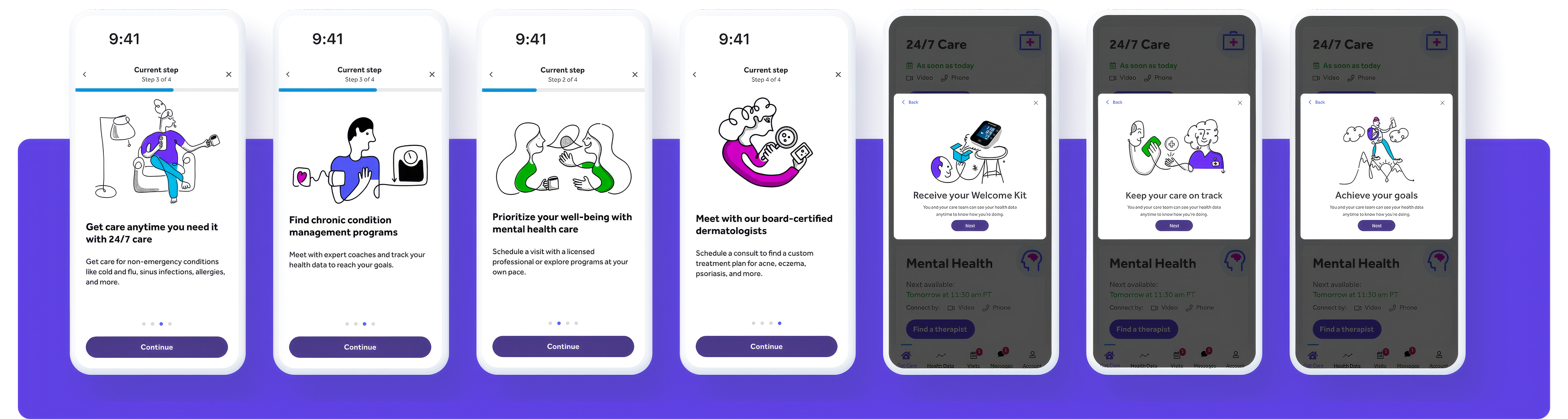
Illustration in the new interface.
Developing how the spot-illustration system would live in product—from guided onboarding to confirmation moments in the refreshed UI.
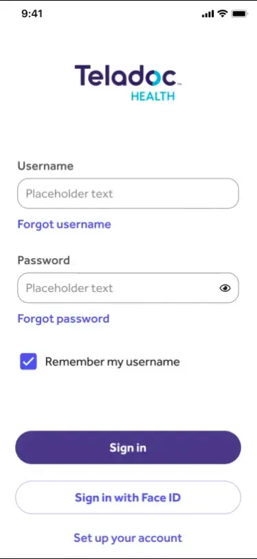
A considered first moment.
An app-launch motion study.
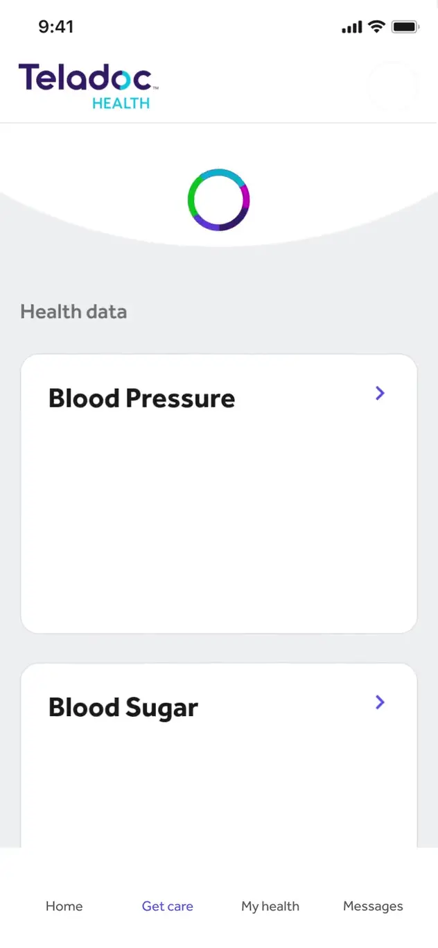
Make updates feel responsive.
Pull-to-refresh feedback for a dashboard of changing health data.
03 / A scalable visual language

Recognizable, even in small spaces.
A graphical icon family carries the brand into everyday product details.
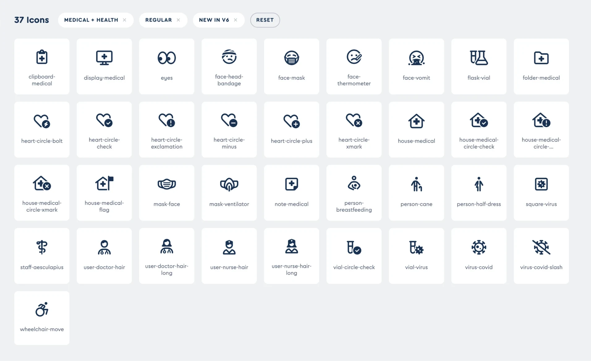
A system with room to grow.
A shared library for a broad range of care and wellness needs.
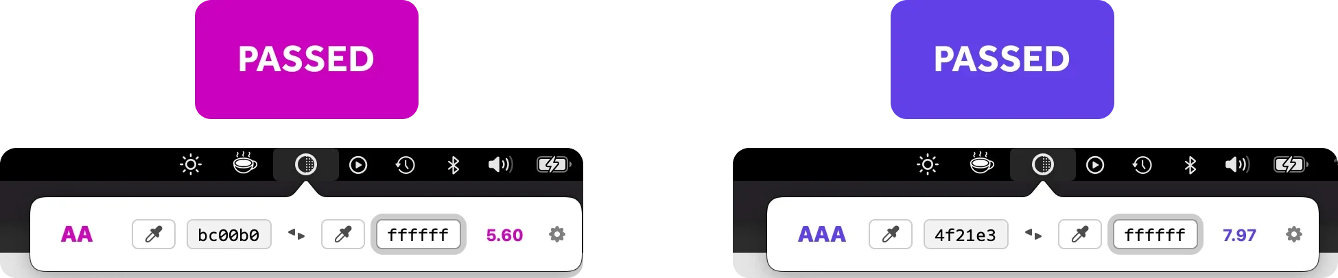
Test the details.
Contrast checks informed the icon colors and line treatments.
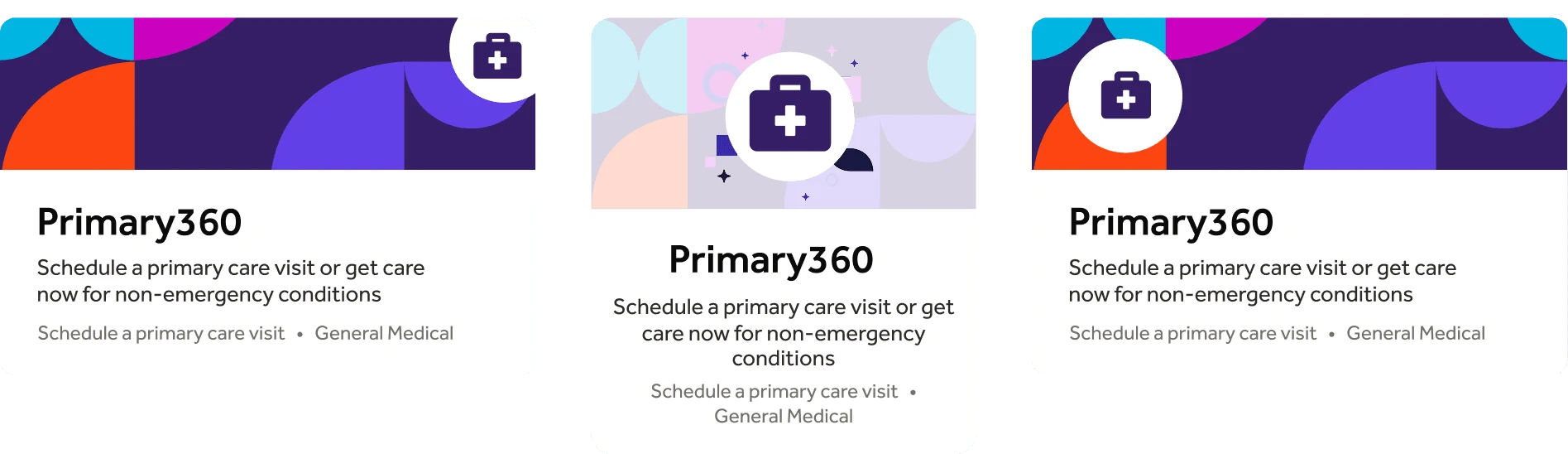
Bring the brand into the choice.
Expressive service cards keep the offer and next action clear.
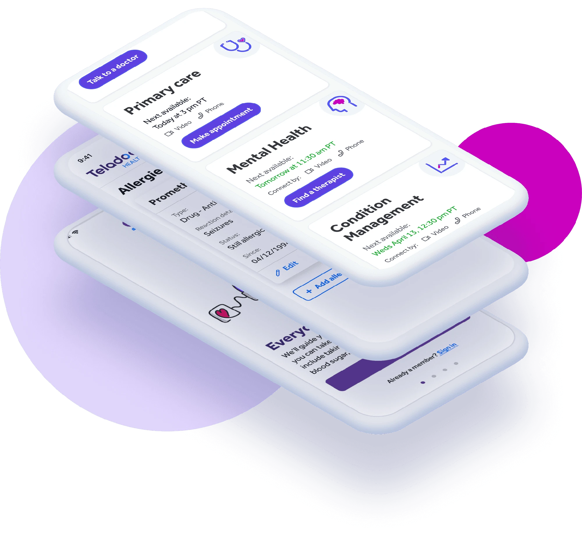
The parts, working together.
Illustration, icons, components, and motion connect the brand to the product.
The problem
What needed to change.
Multiple acquisitions had left Teladoc with disconnected product experiences. The new brand needed to work where trust is earned: helping people understand their options and take the next step.
The work
What I made better.
I shaped the illustration direction, audited key components, explored launch and refresh motion, and built a consistent icon system for the new OneApp experience.
Contribution
Tyler contributed product design and visual systems within Teladoc’s wider OneApp team. Illustration work included exploration and sketches; an independent illustrator created the production artwork.